Stronger with Sara
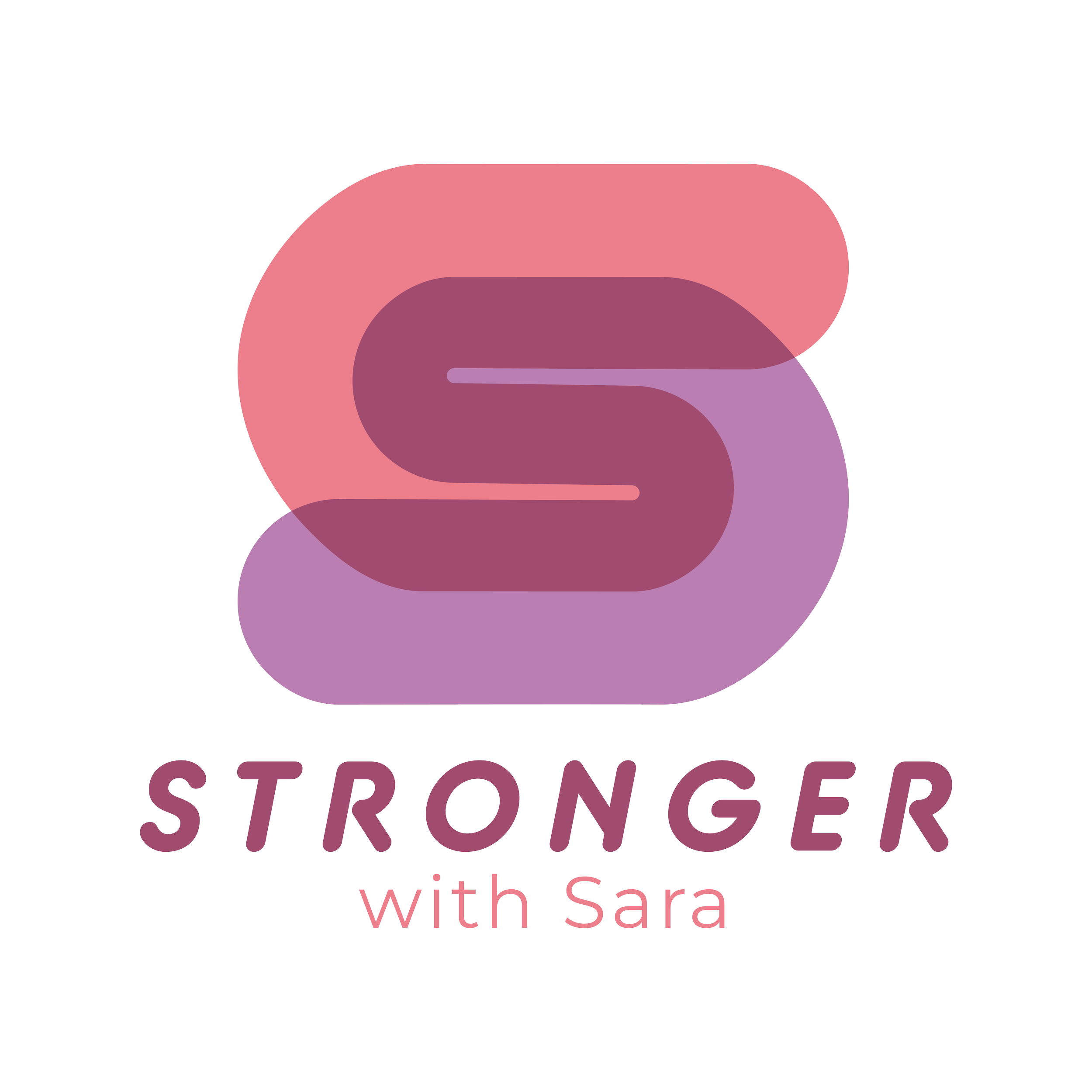
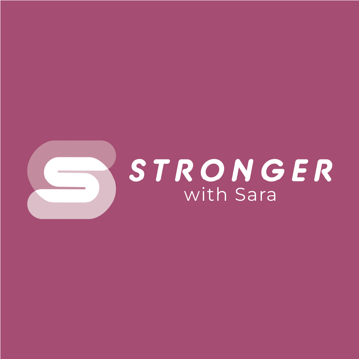
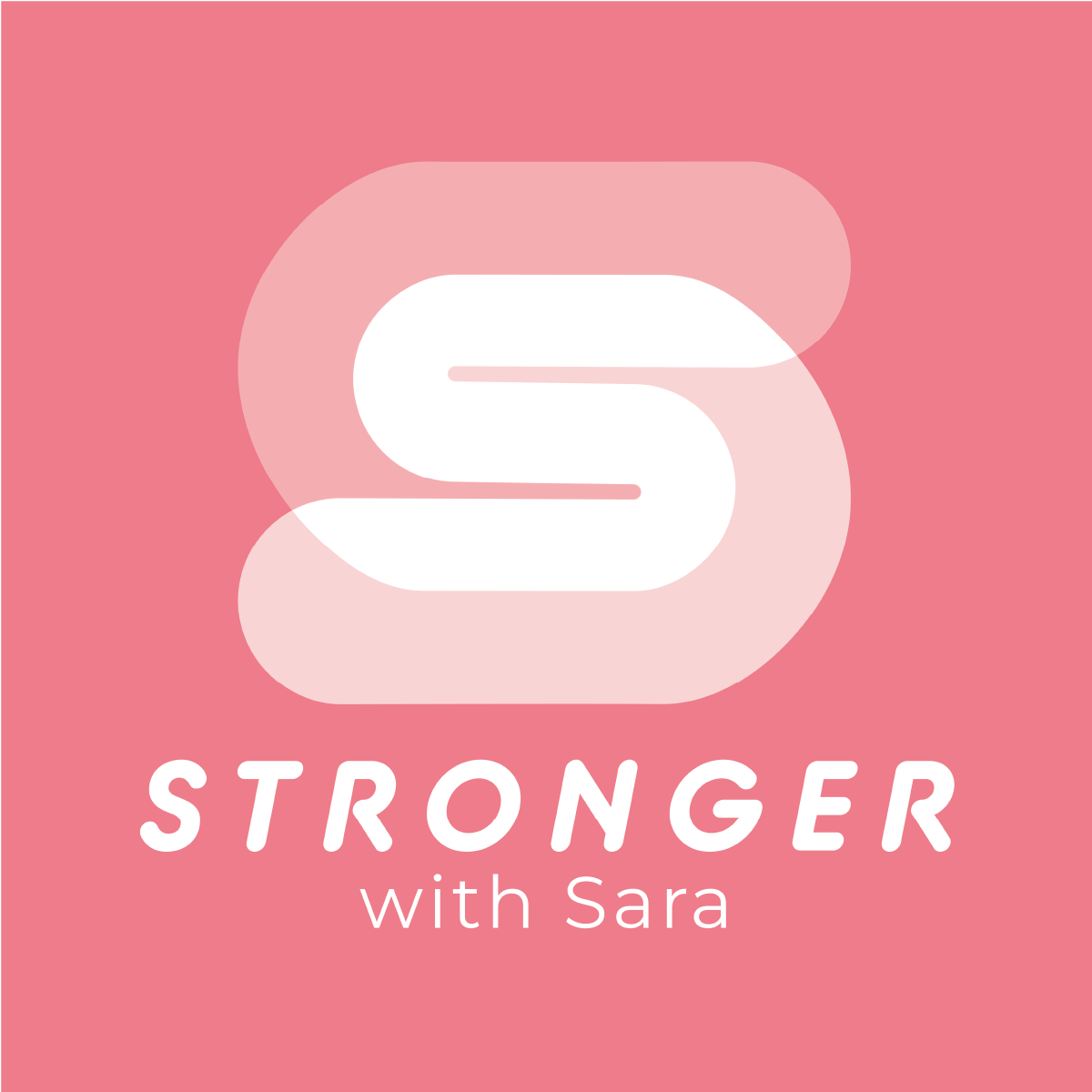
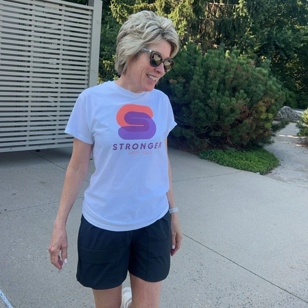
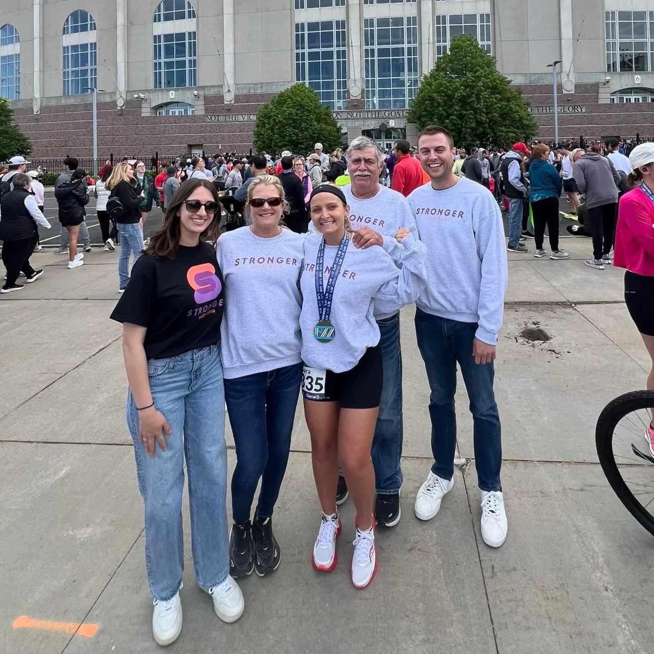
Stronger with Sara’s brand blends strength and femininity in a way that feels powerful but still fun. Designed for a personal trainer who fully embraces her girly side, the pink and purple palette brings energy and personality, while bold, bubbly lettering communicates confidence and capability. A modern typeface with rounded ends gives a nod to classic gym aesthetics without leaning overly macho. Custom icons in the shapes of a dumbbell, kettlebell, and heart reinforce brand identity, and the overlapping, color-contrasting details throughout the letters and marks add a playful, distinctive edge to the brand.
branding